Bucks
Scroll
client
Bucks
year
2026
duration
2 Weeks
location
Canada
overview
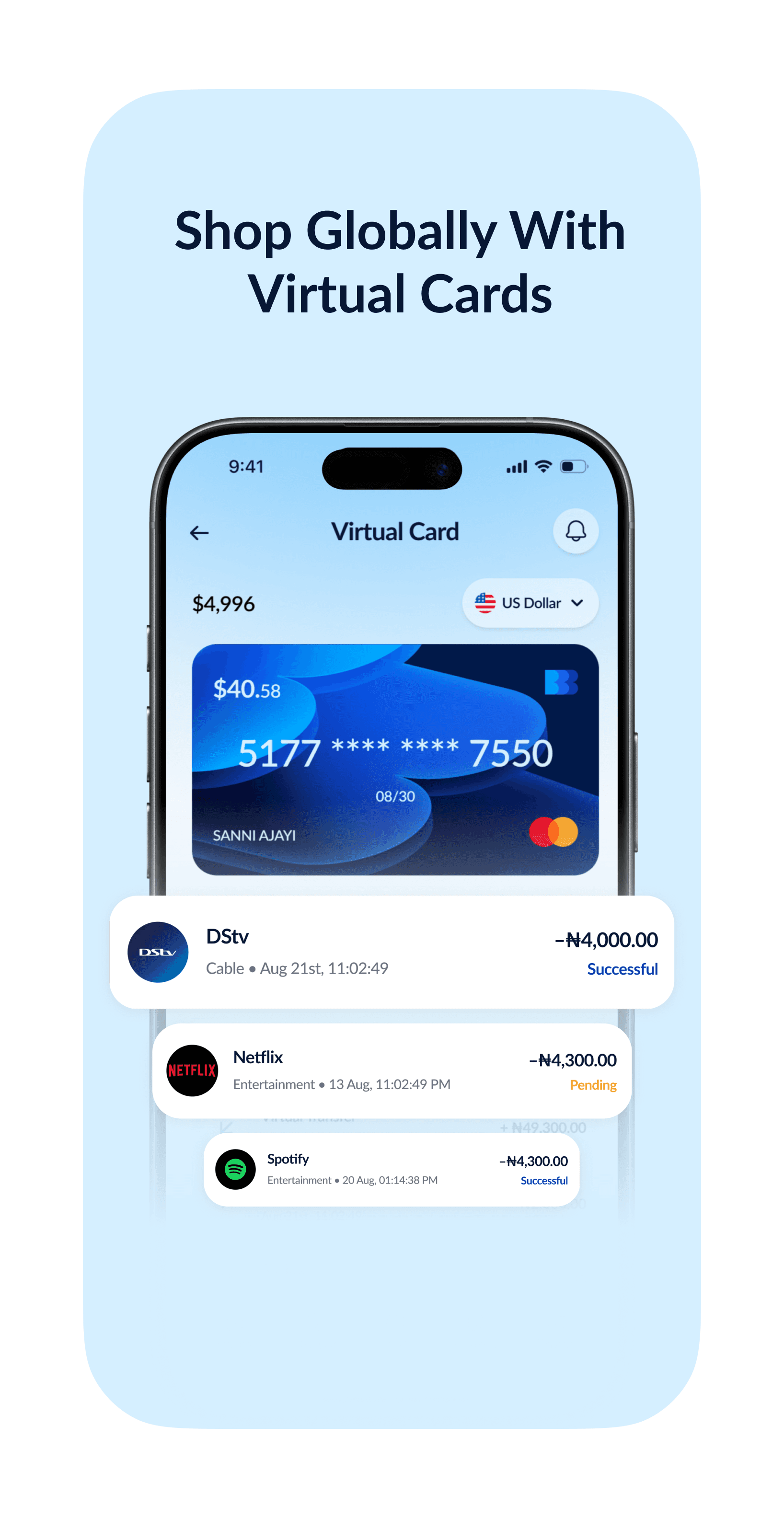
Bucks had a strong product idea, but the mobile experience felt incomplete. The existing flows lacked consistency and there wasn’t a clear visual direction tying the product together, which made some of the core cross-border transactions feel more complicated than they needed to be.

approach
I made a few key decisions: * Simplified the core user flows to reduce friction. * Created clearer hierarchy so important financial information was easier to understand. * Established a more consistent component and spacing system across the app. * Kept the interface clean and familiar while giving it a more distinctive fintech feel. * Focused on making cross-border transactions feel straightforward rather than intimidating. * Used visual cues and interactions to make the product feel more intuitive without adding unnecessary complexity.
Deliverables
Brand Design
System Design
Product Design